
Ann Foundation
Equal opportunities for education
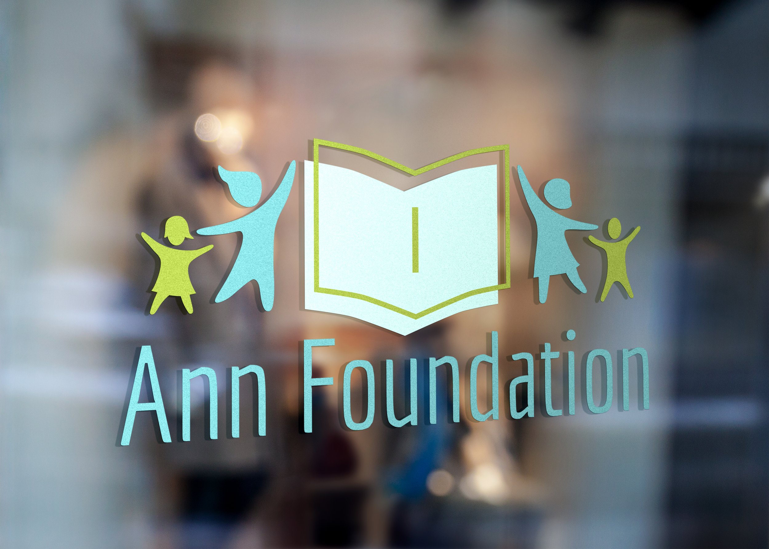
CEO and founder Ann M., came to me looking for a brand refresh. Founder of an international organization helping children for decades with missions across Europe and Asia, she put her life’s work into this mission, but branding sat on the back burner of priorities. That’s where I came in.
Logo design
Ann Foundation
Mood board

Development & creation:
It took several rounds to get this right, but Ann’s number one objective was to visually belay their motto: Empowering disadvantaged children through education. So we hashed out the most important elements of that sentence and what they look like. Ann was persistent on a very straightforward interpretation of education, nothing too abstract or suggestive as this may not communicate correctly internationally. So we strategically thought about fonts, shapes, stacking, and tone. We also introduced two new colors to their established branding and found a compromise on something we were all really happy with. A new logo that is clean, sincere, inclusive, and focused.
Campaign execution:
New branding gave Ann and her international team a new modern start to push their organization to new heights and visually appeal to a larger audience.
See this logo live:

